In a previous post, I wrote about the relative difficulty to create "simple and intuitive" softwares. In this post, we're going to see a concrete example.
The Interactive Floor Plan
The application is an interactive map used during an exhibition.
This application is functionally very simple:
- User must be able to quickly find the stand of one or several exhibitors.
- Each exhibitor is associated with brands, sectors and geographic areas.
- User must be able to find one or several exhibitors by selecting geographical areas, sectors and/or brands.
Nothing very complicated... But this is unfortunately not so simple because the specificity of this kind of system is that its use is very short (often less than a minute). So, if you want to provide a really positive user experience, you must ensure that user will understand "immediately" how to use the device or, at least, that he will be able to learn it quickly and in a "continuous flow". You won't have a second chance.
Houston ... we have a problem
When we organized our first beta tests, we observed that during first selection of a search criterion, for some users, attention was immediately attracted by the highlight of stands on the map. By not noticing filtering of other lists so they can continue their research in more detail, these users seemed very perplex as if they were wondering if they had to find exhibitors randomly, among all highlighted stands. And yet, we had visual feedbacks (modification of contents of lists, modification of counters associated to lists, ...) and a very consistent spatial organization of the interface.
This phenomenon is well known of psychologists, who call it "change blindness".
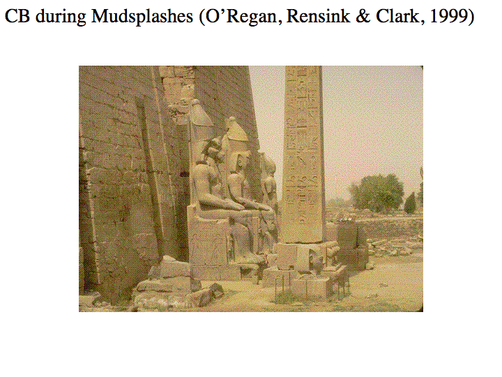
If you're interested by the subject, I invite you to visit the J. Kevin O'Regan's web page (Director of "Psychology of Perception" Laboratory at CNRS) which contains some good examples of this phenomenon.
Remained for us to find a solution to this problem... And cancellation of the highlight of stands was not really a good solution.
Taking into account dimensions of the hardware device (42" touch screens) we knew that if user's attention was focused on the map, this meant that the lists (on which we wanted to get his attention) were in his peripheral vision. Unlike the foveal vision which provides high resolution details, peripheral vision offers a good perception of movement. So we decided to take advantage of this feature of the human eye by adding a short blink of counters associated to the lists (but long enough to be noticed by users).
The result was very good: it allowed us to attract users' attention on the search area, but it also helped users to understand the logical next steps of the interaction.
The funny thing is that when we asked users to verbalize their perception of the experience, they were stating a logical and obvious flow from selection of criterion in a list to filtering of others lists... Even when we could observe that their attention had meanwhile been attracted by highlight of stands.
Keeping it simple is not so simple ...
Because, beyond software development, it also requires to take into account many physiological and psychological factors. That's why creating "simple and intuitive" applications is not so simple but is really exciting.
No comments:
Post a Comment